
How to make images smaller for your website without losing quality
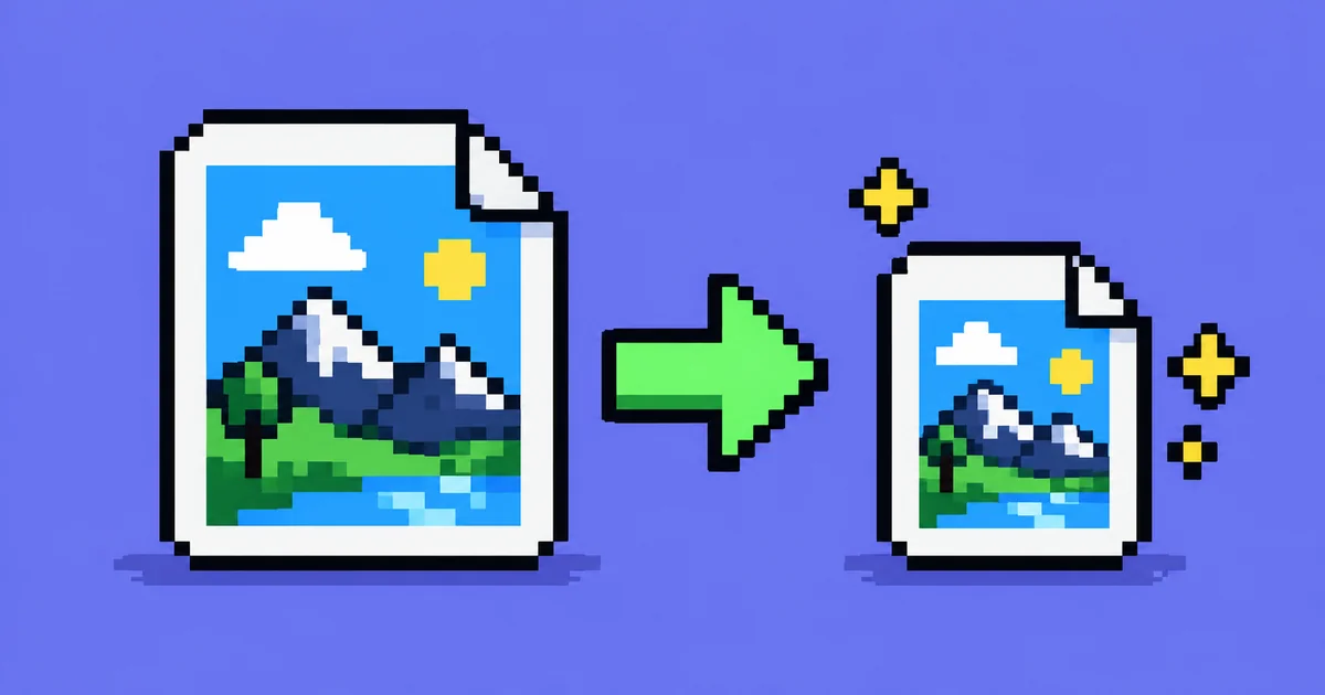
Most images on websites are much heavier than they need to be, and you can usually cut them to a fraction of their size without anyone seeing a difference. It takes three steps: make the image the size it's shown at, save it in the right format and pick sensible compression. None of them needs a developer.
Why it's worth the trouble
Images are the heaviest part of most web pages. In the HTTP Archive's 2025 report, which measures more than 15 million mobile websites, images made up 911 KB of the median mobile page, more than JavaScript, fonts and styles. Lighter images mean the page appears sooner, uses less of the visitor's mobile data and does better on Google's speed measurements.
Here's an example from one of the images on this blog. As a 1200 by 630 pixel PNG, it weighed 612 KB. Saved as WebP at the same dimensions, it's 21 KB, about a thirtieth of the size, and side by side the two look the same.
Step 1: make it the size it's shown at
A photo from a modern phone is often 4,000 pixels wide or more. A blog might show it 800 pixels wide. If you upload the original, every visitor downloads all those extra pixels, and the browser then throws them away to fit the image on the screen.
Find out how wide the image appears on your site and resize it to that width, or to twice that width if you want it sharp on high-resolution screens like those on recent phones and laptops. A photo shown 800 pixels wide needs about 1,600 pixels at most.
Most image editors can do this, and so can Squoosh, the free tool described further down, which has a resize option next to the compression settings.
When the same image appears at different sizes, say full width on a computer and narrower on a phone, a site can offer several versions and let the browser pick the right one. Developers do this with an attribute called srcset. Mozilla's documentation sums up the reason: mobile users "don't want to waste bandwidth by downloading a large image intended for desktop users, when a small image would do". WordPress and some website builders create these versions on their own when you upload an image.
Step 2: pick the right format
JPEG has been the standard for photos for decades. PNG suits graphics with sharp edges or transparency, like screenshots and logos, but it's heavy for photos. Both work everywhere.
WebP, developed by Google, does both jobs in less space. Google says WebP images are 25 to 34% smaller than comparable JPEGs at the same visual quality, and lossless WebP images 26% smaller than PNGs. About 97% of browsers in use support it, according to Can I use, including Safari since version 16.
AVIF is newer and often smaller still. Google's web.dev team says it has seen savings of more than 50% compared with JPEG. Support is a little lower, around 95% of browsers, with Safari on board since version 16.4.
For logos, icons and simple illustrations made of shapes, SVG is often the best choice. An SVG file describes the shapes instead of storing a grid of pixels, so it stays sharp at any size and is usually tiny.
Animated GIFs deserve a special mention, because they're a very old format and very heavy. Turned into a short silent video that plays on its own and loops, they look the same and weigh far less. In an example on Google's web.dev, a 3.7 MB GIF became a 551 KB MP4 and a 341 KB WebM video.
As a rule of thumb: photos as WebP, or AVIF if your site can handle it, logos and icons as SVG, and PNG only when you need every pixel exactly as it is.
Step 3: compress, but not too much
JPEG, WebP and AVIF let you choose a quality level, usually from 0 to 100. Lower means a smaller file and, past a certain point, visible blur, blocky patches or smeared colours. Where that point is depends on the image, so compare with your own eyes.
Google's Lighthouse gives a useful reference. When it checks whether a JPEG is compressed well, it re-saves the image at quality 85 and flags it if that would save at least 4 KB. Around 85 is a reasonable place to start with photos. Then go lower and check whether you can still tell the difference.
Squoosh, a free tool from the Chrome team at squoosh.app, makes this easy. You drop in an image, choose a format and a quality, then drag a slider across the picture to compare the original with the compressed version, with the file size of each shown underneath. It all happens in your browser, so your images aren't uploaded anywhere.
A few details that also count
Phone photos often carry hidden information, including where they were taken if location is switched on for the camera. Social networks usually remove it from the copy other people see, but a file uploaded to your own website may keep it. Re-saving the image in a tool like Squoosh, or exporting it from an image editor, usually leaves that data behind.
Give every image its width and height in the page, so the browser keeps the right amount of space free before the image arrives. Otherwise the text jumps when it loads. Images further down the page can use lazy loading, which waits until the visitor scrolls near them. The main image at the top should load straight away.
Finally, write a short description, the alt text, for every image that carries meaning. Screen readers read it aloud to blind visitors, search engines use it to understand the picture, and it adds nothing to the file size.